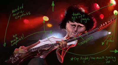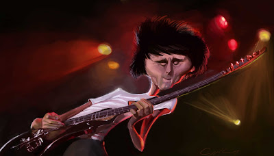

So, i've gotten back to school and i'm now taking a few classes at the local college. one of them is 'fundamentals of design and layout', a great class considering the utter lack of their use in most of my art. Our first project was to bring in four pieces, two representing elements and two representing the principals of design (Google it if you don't know them). i chose to bring in a few of my past caricatures that i thought worked best, one of them being my caricature of Matthew Bellamy, to represent movement.
So we got down to the critique, and sure there was movement, of course it took everyone's eye straight off the page. Not to mention, i missed on a few other key principals. For the most part, what was lacking in this piece was proper emphasis, and balance. there were even a couple of tangents i ignored because nobody had yet to bring them up. Going over what could be fixed in my art, not considering the rendering or likeness, really helped me objectivly look at it as an abstraction and really see where it failed in it's design.
My big mistake was following the reference to closely, for what might have passed in a photo, really made my painting fall apart in terms of composition. So, i've made a few changes, mostly to the background actually, and i'm a lot happier having now considered the principles of design more thoroughly. I just hope i can effectively apply these lessons to future illustrations.
Anyway, I've posted the before and after and a visual description of the changes, i really wish you could hear the critique, it was quite eye opening for me.
and rest assured I'll have more art and some lessons I've learned from my classes up here real soon.
Hope you found this at least a little helpful or simply interesting, let me know what you think.

8 comments:
facinating stuff. Real eye opener for me as well. Thanks for the post!
Great post Will, really interesting - I tend to think I have quite a good eye for design and composition but I'm probably totally wrong! Cool to see how a few small changes can really improve a piece. Plus I love Muse and now I want to do my own Matt Bellamy painting :)
That sounds like a great class. It seems to really have helped you get the most action out of this painting. Cool!
Nice man . . . . good info!
Great that you did that William, I'm sure that it will make your great art even better. Something we should all step back and look into.
I don't know that I would have caught all that before the critique but it does look better after your adjustments.
Thanks for the comments everyone.
nice to hear what you think, i enjoy sharing this kind of thing.
great to see the changes. This is fun piece. Well done.
Really interesting! i'had the idea, but no words! I can't catch these kind of ideas without words! Here, there the words and the illustration! Kind of good tutorial!
Thanx!
Post a Comment